
ZINC / Website + logo design
Miami
Tactical.
A distinct mark.
A direct digital presence.

01 / The project
A focused
foundation.
ZINC designed the Miami Tactical logo and website, giving the name a simple visual identity and a place on screen.
The work pairs a geometric mark with straightforward typography. On the website, a black-and-white foundation gives the photography room to lead, while search and category navigation sit clearly above it.
- Client
- Miami Tactical
- Work
- Website · Logo design
02 / Website design
On screen.
A bold opening image and a practical header give the page two clear jobs: establish the brand and help visitors find their way.
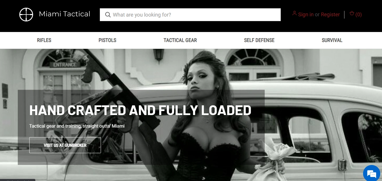
A clear starting point
The logo anchors the header. Search takes a prominent position alongside the account and cart controls.
Categories in view
A separate navigation strip makes the main categories visible before the visitor reaches the opening image.
Photography with presence
The monochrome photograph fills the opening section. A dark overlay holds the headline and supporting text together.
03 / Logo design
The mark
and the name.
A circular crosshair and an open, uppercase wordmark. The identity stays deliberately spare, with the symbol doing the visual work.
A geometric focal point
Concentric circles and intersecting lines form the emblem. Its compact shape balances the long horizontal name.
Room around the wordmark
Clean letterforms and generous spacing keep the name readable. The horizontal arrangement gives the icon and typography their own space.
04 / Visual language
Contrast
with purpose.
Black and white carry the identity. On the website, restrained red accents distinguish utility links without competing with the main image.
The completed scope
A logo and a website, connected through a simple monochrome identity.
Next project / Felon Motorwerk ↗